Performance Responsive Design workshop by Akamai and the London WebPerf
Good morning! Yesterday it was a great learning day.
I was going to attend to a practical workshop about Performance in Responsive Design by Akamai and organized by the London Web Performance Community. That was more or less the whole day but nevertheless, there was a meet up at Skill Matter, organized by the London Software Craftsmanship Community, SOLID Deconstruction. The speaker of the later was Kevlin Henney, one of my favorite speakers so I could not miss it.
In this post I wanted to talk about my learnings in the Responsive Design workshop. Some of the stuff is common sense but it is the kind of things that people usually forget. That talk was lead by Guy Podjarny together with some of the staff in Akamai. The facilities were amazing, the structure and the content of the workshop was so practical, continuous delivery of food and coffee. In addition Guy gave away a free copy of his book Responsive & Fast. All that and more for only 5GBP, amazing stuff.
Why Responsive Web Design, RWD?
Mobile dominating the world
We know the world is been taken by mobile phones and tables. Imagine you are doing some changes to your UI, you have it ready for deploy to live. It is very likely that while your CD system is running the deployment pipeline a few new types of mobile phone have been created.
Mobile is taken the web by surprise. In mobile phones we don’t have the same experience than in the desktop, so some organizations are outsourcing the handling of this world since they want their resource to be focused on delivering new features.
Dedicated web sites
Suddenly some other organizations started to take ownership of the Mobile experience in their website. They created a dedicated web site for mobile devices (http://m.xyz…) with a totally different User Experience. That is still the case for Facebook and many other organizations. Some of the main points on m. web sites are:
-
Dedicated web sites: the UX is the best in mobile phones, they are designed with the smaller space and touch screen in mind. They display information differently, maybe you don’t get some of the widgets that are displayed in the desktop version. In addition they perform the best in mobile devices.
-
When you navigate to Facebook.com from a mobile phone, the server redirects you to the mobile version. This kind be an issue because users notice they are being redirected to a different site. This penalizes Google rating of the web site (the so called SEO, Search Engine Optimization).
-
You need more resources in the organization, typically a mobile team, since you have to maintain yet another web site. That’s why in rough figures, only 26% of the sites offer a m. sites.
-
It is well understood that users expect a similar experience in big screens and mobile. So the functionality must be consistent.
Responsive Web Design
Responsive Web Design (RWD) means having a single website that responds to the current device, and changes its design accordingly.
Whilst a lot of web sites are doing great in creating RWD, performance is usually a topic not considered in there: great, mobile users have a great experience but the page displays slower than it should considering the smaller size. Normally the problem is downloading content, normally RWD download time is double than m. sites (usually downloading unnecessary CSS and JS files). For example CNN used to have a dedicated mdot size that downloaded 571 kb on start up. They moved to a RWD that downloads 4 MB.
We have to take care of performance and UX in RWD. If the former reasons weren’t enough to understand the importance, having a mobile friendly site ranks higher in search engines (look at Google’s recomendations).
So here we have our challenge:
Having a Responsive Web that performs as good as the dedicated mobile sites.
Workshop: Improving RWD performance
After some basic definitions we were given a web site. We started by measuring its performance with WebPageTest. That is a great resource to measure performance, where one can change lots of settings for the tests (including devices, type of connection and much more). Our site wasn’t performing well enough in Mobile devices in a 3G internet connection. Our challenge for the whole day was to improve that. We went to different techniques and apply them, and finally comparing the improvement. We had the source code running on the server available in IceCoder ready to be improve.
Issue: Download and Shrink
In our web site we were using a number of images. Some of these images don’t fit in Mobile so a typical approach is to resize them. The result is that the app loads slower because all the images are yet downloaded in full size. In addition, bigger size means more decoding in the browser.
Solution: Responsive images, loading images in a smarter fashion so that smaller devices download smaller images. We can use web standards to do that. Smaller not only means smaller size but also smaller quality.
Using SRC Set attribute
Provides a list of available image sources and their sizes. Browsers can then use this information to pick the best image source.
	<img src="small.jpg"
	     srcset="large.jpg 1024w, medium.jpg 640w, small.jpg 320w"
	     sizes="(min-width: 36em) 33.3vw, 100vw"
	     alt="A rad wolf">
SRC set is a hint for the browser: even if we set specific for a size, browser can get a different image when loading because of connection issues for example.
Picture element:
Picture is an instruction for the browser, we tell it to download a given image for a given size:
	<picture>
	  <source media="(min-width: 40em)"
	    srcset="big.jpg 1x, big-hd.jpg 2x">
	  <source
	    srcset="small.jpg 1x, small-hd.jpg 2x">
	  <img src="fallback.jpg" alt="">
	</picture>
The problem with srcset and picture is that many browser still don’t support Responsive images, so we have to make use of our loved and hated Javascript…
Using Polyfills
A polyfill, or polyfiller, is a piece of code (or plugin) that provides the technology that you, the developer, expect the browser to provide natively.
If you don’t want to write your own Javascript you can use packages that do the work for you: Picturefill or ImagerJs. One example:
	<div style="width: 240px">
	    <div class="delayed-image-load" data-src="http://placehold.it/{width}" data-alt="alternative text"></div>
	</div>

	<script>
	    new Imager({ availableWidths: [200, 260, 320, 600] });
	</script>
Client Hints
Rather than having the client deciding, with this approach we communicate to the server the size and let the server decide what image to serve:
	GET /img.jpg HTTP/1.1
		User-Agent: Some Browser
		Accept: image/jpg
		CH-DPR: 2.0
		CH-RW: 160
This is also known as Content Negotiation.
Issue: Download and hide
Some of the content in the page is not suitable for mobile devices. We hide it, eg set display none in css.
The problem is that we still are downloading the image. You can see the network using some resource to download it.
Solution: Conditional loading, being smart about the downloaded resources
The idea is great but since it isn’t supported in browsers, the solution is once again…javascript:
	<script>
	function loadReal(img) {
		if (img.display != "none") {
			img.onload = null;
			img.src = img.getAttribute("data-src");
		}
	}
	</script>

	<img src="1px.gif" data-src="book.jpg" alt="A Book" onload="loadReal(this)">
In this example, the src attribute of the img tag points to a cacheable dummy 1x1 pixel GIF, which all images on the page would point to. The real image is mentioned in the data-src attribute. Once the 1x1 image loads (usually very quickly), the element’s onload event would fire, triggering our loadReal() JavaScript loading function. loadReal() simply tests whether the element is visible, and if so, copies the data-src to the src attribute, making the browser load the real image.
Quite smart solution but we don’t need to do it for every image, only for the big images.
Issue: CSS over-downloading
Simple issue, we are adding CSS that we don’t need. That makes a significant impact in the performance.
Solution: Conditional checks for devices:
-
We split the css into different files: base, dektop, mobile.
-
Media attribute renders the proper css based on the size.
-
Some Javascript code will check media query and select the correct css styles.
	<link data-mq="(min-width: 771px)" data-src="/skin/frontend/rwd/default/css/styles_desktop.css"></link>
	<link data-mq="(max-width: 770px)" data-src="/skin/frontend/rwd/default/css/styles_mobile.css" ></link>
	<link data-mq="(min-width: 771px)" data-src="/skin/frontend/rwd/default/css/madisonisland_desktop.css"></link>
	<link data-mq="(max-width: 770px)" data-src="/skin/frontend/rwd/default/css/madisonisland_mobile.css" ></link>

	<script>
		  var scripts = document.getElementsByTagName("link");
		  for(var i=0;i<scripts.length; i++)
		   {
			// Test if the Media Query matches
			var mq = scripts[i].getAttribute("data-mq");
			if (window.matchMedia(mq).matches)
			{
			 // If so, append the new (async) element.
			 var s = document.createElement("link");
			 s.rel = 'stylesheet'
			 s.type = 'text/css';
			 s.href = scripts[i].getAttribute("data-src");
			 document.body.appendChild(s);
			}
		   }
	</script>
The Critical path is an interesting concept that was also mentioned. Use Chrome Bookmarklet by Paul Kinlan to calculate the critical path CSS
Engaging the server side in RWD
This is the so called RESS: REsponsive + Server Side components. Some of the decisions to make the web responsive can be moved to the server. It may look similar to m., but it is actually simpler, you just do changes when a special device is found.
This can be achieved by the use of cookies: we set a cookie in the client and that is use in the request by the server in order to identify the device and deliver different kind of content. There are problem such as having to update the cookie. The solution for that is that your infrastructure can tag the request with the type of device. This is called Edge side includes, being the edge the closest point in the CDN cloud to the client.
We have to bear in mind that RESS and client side decisions are complimentary:
-
Client side decisions are good in the style for example.
-
If we have a big chunk of markup that is not available for mobiles, then RESS is better, so the server doesn’t even servers that.
Some other ideas around that:
Image transcoding: JPEG is an old format nowadays there are better formats including:
- WebP supported in Chrome.
- JSX that is the same but supported in IE
- JPeg2000 supported in Safari.
Using some of these format can enhance performance. The problem is that they are not supported by every browser. The solution again is to load conditionally:
-
Server will select the supported format based on the client browser.
-
Using picture element to load right image format.
Adjust content based on network conditions.
Again you can tag a request with the network taxonomy (using for example Edge side includes) and change the content based on that for a better performance.
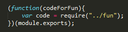
Issue: Third party components:
In our website we have a facebook and twitter plugin. If they render slow, your site renders slow. Basically the page renders until it gets to the plugin, then waits there.
Solution: Load it asynchronously. It is not always doable but normally this kind of third party plugins give you the async option.
In the workshop we use WebTest to simulate bad network conditions and measure the impact of these third party libraries. Similarly we can use SPOF-O-Matic to do similar tests.
The workshop finished by saying that the issues we have been talking are important but there are many other sources of performance issues, being one of the most popular loading too much javascript in the client.
I think that was more than enough to give a taste on this concept. Hope you didn’t fall asleep. Thanks for reading!